
Wednesday, December 19, 2012
Text paths
Friday, December 14, 2012
Emotion Joy

Thursday, December 13, 2012
Butterfly Fireworks

Wednesday, December 5, 2012
Emotion Amazment

Emotion Sadness

Emotion Anger

Emotion Fear

Thursday, November 29, 2012
sample text

This is my name that i made my own font on. I did by typing my name in a text box making the font size 200. I then went to text on the tool bar and converted the text to paths. The letters were then in there own groups. I could then change the letters individually. I put glows and bevels and emboss. I move the letters around and reformed them to make them look cool.
Tuesday, November 27, 2012
cornacopia by tyler on fireworks
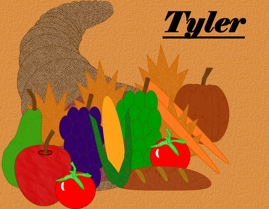
This is my cornucopia that i made on fireworks. It was sort of difficult to create. I used a lot of layers to overlap items in it to give it depth. I also gave each item a texture to give it a real look.I first made a doughnut shape for the opening and put a lighter circle on the inside. I then put smaller circles to make it look like a cornucopia. I then put fruits and vegetables on it. I made the grapes with a bunch of circles made purple and put a stem. I then copied the whole thing and made green grapes. I made the pumpkin with a bunch of ovals to make it look like the sections of a pumpkin then put a stem on it. I made a pare with a circle then used the reshape area tool to give it a neck. I made the apple with a circle and skewed it to look like a apple then put an indent for the stem. I made the corn with a oval and put leaves on it. I put a cross hatched gradient on it. I then made carrots with orange ovals. I made tomatoes with a red circle with green stems.
Wednesday, November 14, 2012
3 Nameplates
 |
| Basic nameplate |
 |
| Mid level nameplate |
This one i had to make it not to bad but not to good. I made the background gradient contour and texture line-diag 2 with black and white colors. Then i inserted a text box and wrote Tyler. The font was Arial Black and the font color was white. I put a drop shadow and a green glow.
 |
| Professional nameplate |
On this one i tried to make it look really professional. For the background i put the gradient as radial with blue and gray as the colors and the texture as grass. I wrote in the text box Tyler and put the font as Elephant and the font color as gray and then put a drop shadow.
Optimizing and Exporting Graphics
In Adobe fireworks you optimize an export graphics. you do this by change the time it takes and amount of colors it has. You then export it to your files. You do this to share with the world what you have created and make it look cool.
Tuesday, November 13, 2012
JPEG by Tyler McDonald
 |
| Tyler McDonald's JPEG |
Thursday, November 8, 2012
Art terminology Definitions
Hue: Hue is another word for color. The attribute which describes colors by name.
Chroma: This is the intensity, or strength, or purity of a color. Squeezing paint directly from the tube to the palette is full chroma.
Tint: Tint is the opposite of shade. Tinting is combining white with a color to make it lighter.
Shade: Using a mixture of black mixed with a color to make it darker. The opposite of shade is tint.
Complementary Colors: Complementary colors are those which appear opposite to one another on a color wheel. The complimentary colors are red and green, blue and orange, and yellow and purple.
Texture: Texture creates the feeling of an object.
Balance: An art and design principle concerned with the arrangement of one or more elements in a work of art so that they appear symmetrical or asymmetrical in design and proportion.
Symmetry: Symmetry is when one side of something balances out the other side.
Source for all the above:http://www.artincanada.com/arttalk/arttermsanddefinitions.html#top
Tone: is a quality of color. It has to do with whether or not a color is warm or cold, bright or dull, light or dim, and pure or otherwise. The phrase Tone it down in Art means to make a color, or an overall color scheme, less vibrant. Toning it up can cause colors to pop out of a piece.
Source: http://arthistory.about.com/cs/glossaries/g/t_tone.htm
Analogous colors: Analogous colors are colors that are adjacent or next to one another on a color wheel. An analogous color scheme is one in which only three adjacent colors are used. The theory is that colors work well or harmonize together. Usually one of these colors is dominant, or used more than the other two, in the painting.
Source:http://painting.about.com/od/artglossarya/g/defanalogous.htm
Contrasting Colors: Two colors that effect each other, one color can change the tone and hue of another
Graphic Design Principles: These suggest effective and pleasing ways to arrange text and graphics. Alignment, balance, consistency, contrast, proximity, and white space are the most widely recoginzed principles of design.
Source: http://desktoppub.about.com/od/designprinciples/Principles_of_Design.htm
graphic formats
A PNG is an acronym or abbreviation that stands for portable networks graphics format. This was made because when GIF was made where you have to pay for them they needed something else. They made PNG to replace it. A bunch of people got together to make it. PNG has better compression and can support millions of colors.
Source:http://info.eps.surrey.ac.uk/FAQ/standards.html
and http://www.internetslang.com/PNG-meaning-definition.asp
A GIF is an abbreviation that stands for Graphics Interchange Format. GIF was made in 1987 because compuserve needed a platform independent image format that was able to transfer across slow conections. There are two types of GIFs 87a and 89a. One was made in 1987 and the other 1998.89a has other features and has improved interlacing.
source: http://info.eps.surrey.ac.uk/FAQ/standards.html
A JPEG is and abbreviation that stands for joint Photographic expert group. It is a standardised image compression mechanism. It is designed for compressing full color or gray-scale digital images of natural scenes.
source:http://info.eps.surrey.ac.uk/FAQ/standards.html
A TIFF is a abbreviation that stands for tagged image file format.TIFF is used for images that come from optical scanners, graphics and photo editing applications. The files can span multiple pages.
source:http://www.tiffviewer.com/tiff-file-format.htm
Subscribe to:
Comments (Atom)